A Gantt chart is a project management tool that visually represents a project's schedule. It uses horizontal bars to show the timeline, dependencies, and progress of tasks, making it easy to track and manage projects from start to finish.
Loading required modules
Everything required to create a Gantt chart are three amCharts 5 modules: "index", "xy" and "gantt".
You can import those in your TypeScript / ES6 application as JavaScript modules:
import * as am5 from "@amcharts/amcharts5";
import * as am5xy from "@amcharts/amcharts5/xy";
import * as am5gantt from "@amcharts/amcharts5/gantt";
import am5plugins_colorPicker from "@amcharts/amcharts5/plugins/colorPicker";
For vanilla JavaScript applications and web pages, you can use "script" version:
<script src="https://cdn.amcharts.com/lib/5/index.js"></script>
<script src="https://cdn.amcharts.com/lib/5/xy.js"></script>
<script src="https://cdn.amcharts.com/lib/5/gantt.js"></script>
<script src="https://cdn.amcharts.com/lib/5/plugins/colorPicker.js"></script>
MORE INFO For more information on installing amCharts 5 as well as loading modules refer to our "Getting started" tutorial.
IMPORTANT Gantt chart uses a Color Picker, which is an external plugin, hence the need to include it.
Instantiating the chart
As with any chart type in amCharts 5, we'll need to start with creation of the Root element.
In it we will create an instance of Gantt class.
let root = am5.Root.new("chartdiv");
let chart = root.container.children.push(
  am5gantt.Gantt.new(root, {})
);
var root = am5.Root.new("chartdiv");
var chart = root.container.children.push(
  am5gantt.Gantt.new(root, {})
);
While technically Gantt is an XY Chart, there is no need to create axes or series for it. Those will be created automatically together with the chart.
MORE INFO The notion of creating class instances using .new() method is described in "Creating a chart" section in the "Getting started" tutorial. Make sure you check it out.
Configuring the chart
Edit mode
Gantt chart can be displayed in two modes:
- Editable (on by default), where user can add/remove/edit tasks via user interface.
- Read-only, where user can only view the chart, but can't make any edits to data.
By default, the chart is displayed in editable mode. To disable it, use editable setting:
let chart = root.container.children.push(
  am5gantt.Gantt.new(root, {
    editable: false
  })
);
var chart = root.container.children.push(
  am5gantt.Gantt.new(root, {
    editable: false
  })
);
Duration units
All tasks on the Gantt chart are measured in a numeric "duration" values, which are provided in data.
Those can be set in Gantt's setting durationUnit. Available values: "year", "month", "week", "day" (default), "hour", "minute", and "second".
let chart = root.container.children.push(
  am5gantt.Gantt.new(root, {
    durationUnit: "hour"
  })
);
var chart = root.container.children.push(
  am5gantt.Gantt.new(root, {
    durationUnit: "hour"
  })
);
Weekends and holidays
The Gantt chart can exclude certain non-working days, such as weekends and holidays, from the task durations. For example, if a 3-day task starts at Thursday it will end on Monday, rather than Sunday.
Saturday and Sunday is considered to be a weekend by default, but we can modify it using weekends setting, which accepts an array of numbers, denoting each week day, starting with 0 for Sunday, 1 for Monday, etc.
Weekend exclusion can be disabled by setting excludeWeekends to false.
There's an additional setting - holidays - which accepts an array of Date objects. The days identified as holidays will not be counted towards the task duration, resembling the functionality of weekends.
let chart = root.container.children.push(
  am5gantt.Gantt.new(root, {
    durationUnit: "hour",
    weekends: [0,5,6], // Set Sunday, Friday, and Saturday as non-working days
    excludeWeekends: true,
    holidays: [
      new Date(2025, 0, 1),   // New Year Day
      new Date(2025, 6, 4),   // Independence Day
      new Date(2025, 10, 27)  // Thanksgiving
    ]
  })
);
var chart = root.container.children.push(
  am5gantt.Gantt.new(root, {
    durationUnit: "hour",
    weekends: [0,5,6], // Set Sunday, Friday, and Saturday as non-working days
    excludeWeekends: true,
    holidays: [
      new Date(2025, 0, 1),   // New Year Day
      new Date(2025, 6, 4),   // Independence Day
      new Date(2025, 10, 27)  // Thanksgiving
    ]
  })
);
Snapping behavior
When manually resizing or moving the task bars, they will snap to either start or beginning of the target period (e.g. day). A setting snapThreshold controls the position within the period that determines the direction of this action.
The setting accepts values from 0 (zero) to 1 (one), that indicate relative position within the period. The default is 0.5 which means that the task bar's end that is currently being dragged will snap to the beginning of the period if dropped within the first half, and similarly snap to the end if dropped in the second half.
If we'd like to tweak the behavior to make it snap to the end if dropped anywhere on the last 70% of the period cell, we'd need to set snapThreshold to 0.3:
let chart = root.container.children.push(
  am5gantt.Gantt.new(root, {
    snapThreshold: 0.3
  })
);
var chart = root.container.children.push(
  am5gantt.Gantt.new(root, {
    snapThreshold: 0.3
  })
);
Category axis width
Normally, the width of the left area of the chart which contains categories and related controls takes up 30% of the whole chart.
We can change that using Gantt chart's setting sidebarWidth. The setting accepts fixed numeric values in pixels or relative width as Percent.
let chart = root.container.children.push(
  am5gantt.Gantt.new(root, {
    sidebarWidth: 300
  })
);
var chart = root.container.children.push(
  am5gantt.Gantt.new(root, {
    sidebarWidth: 300
  })
);
Setting data
Unless we intend to start with an empty chart, we need to set the initial Gantt data in two places:
- Category data on the vertical axis, which is a
CategoryAxis. - Task data on the chart's Gantt series.
Category data
While Gantt's category axis is essentially a CategoryAxis, its data can carry more information than just a list of categories. It also includes hierarchy relations (parent category links), colors (each category can have a custom color assigned to it), and state (is category collapsed or expanded).
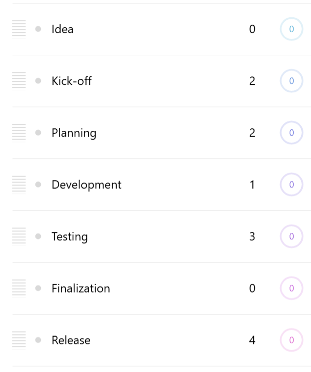
Here's a sample "flat data" (single level):
[{
  name: "Idea",
  id: "gantt_0"
}, {
  name: "Kick-off",
  id: "gantt_1"
}, {
  name: "Planning",
  id: "gantt_2"
}, {
  name: "Development",
  id: "gantt_3"
}, {
  name: "Testing",
  id: "gantt_4"
}, {
  name: "Finalization",
  id: "gantt_5"
}, {
  name: "Release",
  id: "gantt_6"
}]
As you can see from the sample above, each item contains two keys: a category id which needs to be unique, and a name that will be used for display and can repeat across multiple categories.
Here's a more complex sample data, that shows how ids are used to create a multi-level, nested category tree:
[{
  name: "Idea",
  id: "gantt_0"
}, {
  name: "Preparation",
  id: "gantt_1"
}, {
  name: "Kick-off",
  id: "gantt_2",
  parentId: "gantt_1"
}, {
  name: "Planning",
  id: "gantt_3",
  parentId: "gantt_1"
}, {
  name: "Implementation",
  id: "gantt_4"
}, {
  name: "Setup",
  id: "gantt_5",
  parentId: "gantt_4"
}, {
  name: "Development",
  id: "gantt_6",
  parentId: "gantt_4"
}, {
  name: "Finalization",
  id: "gantt_7",
  parentId: "gantt_4"
}, {
  name: "Release",
  id: "gantt_8"
}]
Besides id and name fields, it introduces a third one: parentId. When, set it will treat the category as a child for another category with that specific id.

In addition to id, name, and parentId, the data can contain additional information. Here's the full list:
| Field | Type | Example | Comment |
|---|---|---|---|
id | string | "cat_1" | A unique category id. |
name | string | "Testing" | A category name. |
parentId | string | "cat_0" | The id of the parent category. |
collapsed | boolean | true | Whether category should start off collapsed. |
color | number || Color | 0xff0000 | A category color. |
Setting category data
Like with a regular CategoryAxis, we use its data.setAll() method:
gantt.yAxis.data.setAll([{
  name: "Idea",
  id: "gantt_0"
}, {
  name: "Kick-off",
  id: "gantt_1"
}, {
  name: "Planning",
  id: "gantt_2"
}, {
  name: "Development",
  id: "gantt_3"
}, {
  name: "Testing",
  id: "gantt_4"
}, {
  name: "Finalization",
  id: "gantt_5"
}, {
  name: "Release",
  id: "gantt_6"
}]);
Category axis data fields
The fields in data do not necessarily have to be named like in the above example. They can be changed via category axis' data field settings, e.g.:
chart.yAxis.setAll({
  nameField: "task",
  collapsedField: "closed"
});
chart.yAxis.setAll({
  nameField: "task",
  collapsedField: "closed"
});
Here's a full list of field settings:
| Setting | Default | Comment |
|---|---|---|
idField | "id" | A unique category id. |
nameField | "name" | A category name. |
parentIdField | "parentId" | The id of the parent category. |
collapsedField | "collapsed" | Whether category should start off collapsed. |
colorField | "color" | A category color. |
Using same field for id and name
If we can assure that we can keep category names unique, we can reuse the same field in data for both the ids and names, by setting nameField to the same value as idField, e.g. "id":
chart.yAxis.setAll({
  nameField: "id"
});
chart.yAxis.setAll({
  nameField: "id"
});
Now we can simplify our category data:
[{
  id: "Idea"
}, {
  id: "Preparation"
}, {
  id: "Kick-off",
  parentId: "Preparation"
}, {
  id: "Planning",
  parentId: "Preparation"
}, {
  id: "Implementation"
}, {
  id: "Setup",
  parentId: "Implementation"
}, {
  id: "Development",
  parentId: "Implementation"
}, {
  id: "Finalization",
  parentId: "Implementation"
}, {
  id: "Release"
}]
Series data
The information about the actual tasks are provided via Gantt series data.
Here's a sample series data:
[{
  start: 1758142800000,
  duration: 0,
  progress: 0,
  id: "gantt_0",
  linkTo: ["gantt_1"]
}, {
  start: 1758142800000,
  duration: 2,
  progress: 0,
  id: "gantt_1",
  linkTo: ["gantt_2"]
}, {
  start: 1758488400000,
  duration: 2,
  progress: 0,
  id: "gantt_2",
  linkTo: ["gantt_3"]
}, {
  start: 1758661200000,
  duration: 1,
  progress: 0,
  id: "gantt_3",
  linkTo: ["gantt_4"]
}, {
  start: 1758747600000,
  duration: 3,
  progress: 0,
  id: "gantt_4",
  linkTo: ["gantt_5"]
}, {
  start: 1759179600000,
  duration: 0,
  progress: 0,
  id: "gantt_5",
  linkTo: ["gantt_6"]
}, {
  start: 1759179600000,
  duration: 4,
  progress: 0,
  id: "gantt_6"
}])
Each task item can contain the following details:
| Field | Type | Example | Comment |
|---|---|---|---|
id | string | "cat_1" | A related category id. |
start | number | 1759179600000 | A timestamp for task's start. |
duration | number | 4 | Task length in duration units, e.g. days. |
progress | number | 0.5 | A completion progress. 0 - not started, 0.5 - 50% complete, 1 - finished. |
linkTo | array<string> | ["gantt_6"] | An array of category ids that this task's end should be linked to the beginning of. |
Series data fields
As with the axis, the fields in data do not necessarily have to be named like in the above example. They can be changed via series' data field settings, e.g.:
chart.series.setAll({
  durationField: "days",
  progressField: "completion"
});
chart.series.setAll({
  durationField: "days",
  progressField: "completion"
});
Here's a full list of field settings:
| Setting | Default | Comment |
|---|---|---|
idField | "id" | Parent category id. |
openValueXField | "start" | Task start timestamp. |
progressField | "progress" | Completion progress value (0-1). |
durationField | "duration" | Task length duration units, e.g. days. |
linkToField | "linkTo" | Array of category ids containing linked tasks. |
Category (vertical) axis
The vertical axis in a Gantt chart is an axis of type GanttCategoryAxis. It's accessible via chart's yAxis property, and is essentially an enhanced CategoryAxis.
Cell height
Each cell on the category axis will be sized according to available space.
We can use Gantt chart category's setting minCellHeight to set the minimum possible height of the category in pixels. (default: 70)
If there are more categories than the chart area is capable to accommodate at minCellHeight, the plot area will become scrollable.
chart.yAxis.setAll({
  minCellHeight: 80
});
chart.yAxis.setAll({
  minCellHeight: 80
});
Cell height for child categories
The minCellHeight setting affect the size (height) of the top-level categories.
The height of child categories is 70% of the height of the parent ones, to make them appear smaller.
The relative child category size can be controlled using axis' childCellSize setting, which accepts a number, where 1 (one) means the same size as parent.
For example, if we'd like the child categories to be of equal size as parent, we'd set it to 1 (one):
chart.yAxis.setAll({
  childCellSize: 1
});
chart.yAxis.setAll({
  childCellSize: 1
});
Child category offset
The titles for child categories are shown offset to the right to emphasize the hierarchy. The offset for each new level is 25 pixels, and is configurable via category axis' childShift setting.
chart.yAxis.setAll({
  childShift: 0
});
chart.yAxis.setAll({
  childShift: 0
});
The above code will disable offsetting of child categories.
Timeline (horizontal) axis
Gantt chart has two axes: primary and secondary. Both are created automatically when Gantt chart is instantiated, and are accessible via xAxis and xAxisMinor properties, in case we'd like to configure them beyond the defaults:
chart.xAxis; // Primary axis
chart.xAxisMinor; // Secondary axis
chart.xAxis; // Primary axis
chart.xAxisMinor; // Secondary axis
The primary axis acts like a regular XY Chart Date axis, dynamically adjusting its granularity to best suit current available space and zoom.
The secondary axis is used for providing a more granular grid, e.g. if primary axis displays a weekly grid, the secondary one will display a grid/label for each individual day.
Grid intervals
The grid intervals for the secondary axis is chosen dynamically, based on the current granularity of the primary axis.
For example, if the primary axis scope is large enough to display increments in years, the secondary axis will switch to either weekly or monthly increments, depending on available space and minGridDistance setting on the secondary axis' renderer.
This is controlled via Gantt chart's gridIntervals settings, with the default set like this:
{
  "year": [
    { timeUnit: "week", count: 1 },
    { timeUnit: "month", count: 1 },
    { timeUnit: "month", count: 2 },
    { timeUnit: "month", count: 6 }
  ],
  "month": [
    { timeUnit: "week", count: 1 },
    { timeUnit: "week", count: 2 }
  ],
  "week": [
    { timeUnit: "day", count: 1 }
  ],
  "day": [
    { timeUnit: "hour", count: 1 },
    { timeUnit: "hour", count: 3 },
    { timeUnit: "hour", count: 6 },
    { timeUnit: "hour", count: 12 }
  ],
  "hour": [
    { timeUnit: "minute", count: 1 },
    { timeUnit: "minute", count: 5 },
    { timeUnit: "minute", count: 15 },
    { timeUnit: "minute", count: 30 }
  ],
}
MORE INFO For information on how grid intervals work, refer to "Date axis" documentation.
Disabling secondary X-axis
To disable secondary axis, simply call its hide() method:
chart.xAxisMinor.hide();
chart.xAxisMinor.hide();
Marked dates
Gantt chart offers a functionality for users to toggle visual markers (vertical lines) on any date (or other time period) by clicking on the secondary axis.
The functionality can be disabled by removing "click" event from the secondary axis:
gantt.xAxisMinor.events.off("click");
gantt.xAxisMinor.events.off("click");
MORE INFO For information on customizing the markers' appearance please refer to "Customizing Gantt appearance".
Gantt series
Gantt series is a heavily customized ColumnSeries, meaning that anything we can to with the latter, we can do with Gantt series, too.
The series is created automatically, and is accessible via Gantt chart's series property.
gantt.series.columns.template.setAll({
  strokeWidth: 2,
  height: am5.percent(90)
});

gantt.series.columns.template.adapters.add("stroke", function() {
  return am5.color(0x000000)
});
gantt.series.columns.template.setAll({
  strokeWidth: 2,
  height: am5.percent(90)
});

gantt.series.columns.template.adapters.add("stroke", function() {
  return am5.color(0x000000)
});
For a thorough documentation, please refer to ColumnSeries docs.
MORE INFO For information on customizing series' elements please refer to "Customizing Gantt appearance".
Colors
Auto-assigned colors
By default, Gantt chart will assign a unique color for each newly added task. Whenever a new task is added, the chart pulls the next color from a "color set". The colors depend on the theme used.
Gantt's color set can be accessed via chart's colors setting, and used to configure available colors, stepping parameters, or even disable color iteration altogether.
The following example defines a pre-defined list of colors:
chart.get("colors").set("colors", [
  am5.color(0x095256),
  am5.color(0x087f8c),
  am5.color(0x5aaa95),
  am5.color(0x86a873),
  am5.color(0xbb9f06)
]);
chart.get("colors").set("colors", [
  am5.color(0x095256),
  am5.color(0x087f8c),
  am5.color(0x5aaa95),
  am5.color(0x86a873),
  am5.color(0xbb9f06)
]);
Or, if we'd like all newly-added tasks use the same color, we can do so by disabling color set stepping:
gantt.get("colors").setAll({
  colors: [ am5.color(0x095256)],
  step: 0
});
gantt.get("colors").setAll({
  colors: [ am5.color(0x095256)],
  step: 0
});
MORE INFO For information about configuring color sets, refer to "Colors, gradients and patterns" tutorial.
Colors via the UI
Colors for tasks/categories can be changed via UI using built-in color picker component.
Users can click on a task or the category to select it, then click on the color picker button in the upper left corner to change the color.
Hide the color picker button to disable the functionality:
chart.colorPickerButton.hide(0);
chart.colorPickerButton.hide(0);
Buttons
Control buttons
Gantt chart comes with a selection of controls (buttons), lined up in the upper-left corner.
They are added as children to chart's controls container, and are accessible via dedicated properties:
| Chart property | Class | Function |
|---|---|---|
addButton | Button | Adds a new task. |
colorPickerButton | ColorPickerButton | Invokes a color picker. |
expandButton | Button | Expands all categories. |
collapseButton | Button | Collapses all categories. |
linkButton | Button | Toggles auto-linking to newly added tasks. |
clearButton | ConfirmButton | Deletes all data (categories, tasks, marked dates). |
editButton | Button | Toggles between edit and read-only modes. (hidden by default) |
If we'd like to hide certain buttons, we can do so using their hide() method:
chart.colorPickerButton.hide(0);
chart.clearButton.hide(0);
chart.addButton.hide(0);
chart.colorPickerButton.hide(0);
chart.clearButton.hide(0);
chart.addButton.hide(0);
Or, if we'd like to hide all controls, we can just hide the whole controls container:
chart.controls.hide(0);
chart.controls.hide(0);
The edit button is hidden by default. Use show() method on it, to unihide:
chart.editButton.show(0);
chart.editButton.show(0);
Zoom buttons
In chart's plot area, depending on zoom conditions, there might be two buttons displayed: Zoom out and Fit tasks to view.
| Chart property | Class | Function |
|---|---|---|
zoomOutButton | Button | Zooms out the X axis to full width. |
fitButton | Button | Zooms the X axis to fit currently visible tasks. |
As with the control buttons, those can be disabled individually:
If we'd like to hide certain buttons, we can do so using their hide() method:
chart.zoomOutButton.hide(0);
chart.fitButton.hide(0);
chart.zoomOutButton.hide(0);
chart.fitButton.hide(0);
Events and data serialization
Please refer to "Serializing and restoring Gantt data".
Example
See the Pen Gantt chart by amCharts team (@amcharts) on CodePen.