Timeline chart is used to create axis-based two-dimensional plots that can follow serpentine, spiral, or basically any custom shape. It can be used to depict linear data in a space-saving, non-boring way. The following sections will get you acquainted with this unique chart type.
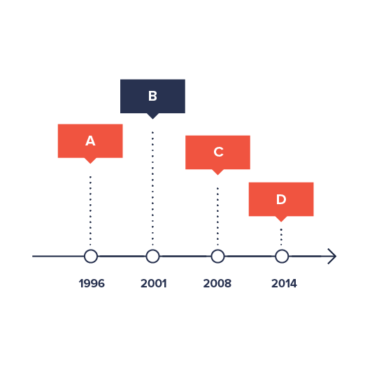
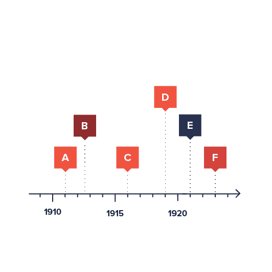
Below are a few of super-basic examples from our friends at Data Viz Project:
However, as we will see during the course of this article, it can be much much more.
Timeline vs XY
We can think of a Timeline chart as a twisted XY chart. Under the hood, it is in fact an XY chart, inheriting all of its capabilities and functionality, except for a few differences and additions, which we will discuss during this tutorial.
To keep it simple, we are going to provide bare basics here, and will not repeat vas information outlined in XY-related tutorials.
In a nutshell, Timeline chart acts and is configured much like XY chart, except it uses different classes:
| Timeline class | Equivalent XY class |
|---|---|
CurveChartSerpentineChartSpiralChart | XYChart |
CurveColumnSeries | ColumnSeries |
CurveLineSeries | LineSeries |
CurveCursor | XYCursor |
AxisRendererCurveX | AxisRendererX |
AxisRendererCurveY | AxisRendererY |
Now that we have this out of the way, let's look at common components that Timeline chart is made of.
Loading required modules
Timeline charts require three amCharts 5 modules: "index", "xy", and "timeline".
You can import those in your TypeScript / ES6 application as JavaScript modules:
import * as am5 from "@amcharts/amcharts5";
import * as am5xy from "@amcharts/amcharts5/xy";
import * as am5timeline from "@amcharts/amcharts5/timeline";
For vanilla JavaScript applications and web pages, you can use "script" version:
<script src="https://cdn.amcharts.com/lib/5/index.js"></script>
<script src="https://cdn.amcharts.com/lib/5/xy.js"></script>
<script src="https://cdn.amcharts.com/lib/5/timeline.js"></script>
MORE INFO For more information on installing amCharts 5 as well as loading modules refer to our "Getting started" tutorial.
Instantiating the chart
As with any chart type in amCharts 5, we'll need to start with creation of the Root element.
In it we will create an instance of one of the Timeline classes: CurveChart, SerpentineChart, or SpiralChart. We will look at the differences for each of those in later sections of this tutorial.
let root = am5.Root.new("chartdiv");
let chart = root.container.children.push(
  am5timeline.SerpentineChart.new(root, {})
);
var root = am5.Root.new("chartdiv");
var chart = root.container.children.push(
  am5timeline.SerpentineChart.new(root, {})
);
MORE INFO The notion of creating class instances using .new() method is described in "Creating a chart" section in the "Getting started" tutorial. Make sure you check it out.
Adding axes
Just like any XY-based chart, a Timeline chart requires at least one X axis and one Y axis, although it can support any number of axes.
The chart has two properties: xAxes and yAxes.
xAxes hold axes that start out horizontally. yAxes hold vertical axes. However, given the nature of the Timeline chart, which can take any shape, those may be arbitrary.
To add axes to chart we just push their instances to the respective list:
let xAxis = chart.xAxes.push(
  am5xy.DateAxis.new(root, {
    renderer: am5timeline.AxisRendererCurveX.new(root, {})
  })
);

let yAxis = chart.yAxes.push(
  am5xy.ValueAxis.new(root, {
    renderer: am5timeline.AxisRendererCurveY.new(root, {})
  })
);
var xAxis = chart.xAxes.push(
  am5xy.DateAxis.new(root, {
    renderer: am5timeline.AxisRendererCurveX.new(root, {})
  })
);

var yAxis = chart.yAxes.push(
  am5xy.ValueAxis.new(root, {
    renderer: am5timeline.AxisRendererCurveY.new(root, {})
  })
);
The above will create a vertical axis of type ValueAxis, which is used to indicate numeric value, as well as a DateAxis to be used as "horizontal" axis.
There are number of different axes types. We will examine those in subsequent sections.
Axis renderer
The axis object itself provides logic functionality. It relies on a helper class to actually render it. That's where "renderer" comes in.
To put it differently, axis knows how to treat data, calculate scale, etc. It does not care about how it should be displayed.
Renderer, knows how to put the axis on screen.
For example, a ValueAxis on X would be drawn differently than on Y. That's why we need to specify a renderer, which "specializes" of displaying an axis in specific direction.
Timeline chart uses two types of renderers: AxisRendererCurveX and AxisRendererCurveY.
Axis types
Timeline chart supports 4 axis types:
| Class | Comment | |
|---|---|---|
CategoryAxis | For plotting data with string identifiers - categories. | More info |
CategoryDateAxis | For plotting time-based data without maintaining actual time scale. Grid/labels are displayed only where there is actual data. | More info |
DateAxis | For plotting time-based data. The axis will maintain natural time scale regardless on how actual data points are spaced out. | More info |
ValueAxis | For plotting numeric values. | More info |
Some axis types require additional configuration besides renderer to work.
For example CategoryAxis needs categoryField which specifies a field in data that holds category names, as well as the actual data, so that it knows which categories to display:
let xAxis = chart.xAxes.push(
  am5xy.CategoryAxis.new(root, {
    renderer: am5timeline.AxisRendererCurveX.new(root, {}),
    categoryField: "category"
  })
);
xAxis.data.setAll([{
  category: "Research"
}, {
  category: "Marketing"
}, {
  category: "Sales"
}];
var xAxis = chart.xAxes.push(
  am5xy.CategoryAxis.new(root, {
    renderer: am5timeline.AxisRendererCurveX.new(root, {}),
    categoryField: "category"
  })
);
xAxis.data.setAll([{
  category: "Research"
}, {
  category: "Marketing"
}, {
  category: "Sales"
}];
Similarly, DateAxis needs to know granularity of your data, set via baseInterval property:
let xAxis = chart.xAxes.push(
  am5xy.DateAxis.new(root, {
    renderer: am5timeline.AxisRendererCurveX.new(root, {}),
    baseInterval: {
      timeUnit: "day",
      count: 1
    }
  })
);
var xAxis = chart.xAxes.push(
  am5xy.DateAxis.new(root, {
    renderer: am5timeline.AxisRendererCurveX.new(root, {}),
    baseInterval: {
      timeUnit: "day",
      count: 1
    }
  })
);
MORE INFO For information on configuring and using each axis type, please refer to the dedicated "Axes" tutorial, or click on an axis class name in the table above.
Configuring series
For more information on how to configure axes, please visit Configuring XY (and timeline) axes.
Adding series
Timeline chart is a "serial" chart, meaning it needs at least one series to display anything.
As with anything else in amCharts 5, we create a series object using new() method of its class.
There is also a number of properties that need to be set for series, like its X and Y axis, as well as data fields.
We will look at those shortly, but here's a very basic example of CurveColumnSeries usage:
let series = chart.series.push(
  am5timeline.CurveColumnSeries.new(root, {
    name: "Series",
    xAxis: xAxis,
    yAxis: yAxis,
    valueYField: "value",
    valueXField: "date"
  })
);
var series = chart.series.push(
  am5timeline.CurveColumnSeries.new(root, {
    name: "Series",
    xAxis: xAxis,
    yAxis: yAxis,
    valueYField: "value",
    valueXField: "date"
  })
);
Let's examine the above.
Assigning series to axis
This is pretty much self-explanatory. We use series xAxis property to tell which axis object will be series X-axis (or "circular "horizontal" axis), and yAxis to specify which axis is responsible for its Y ("vertical") plot.
Each series can have only on X and one Y axis, whereas an axis can have any number of series attached to it.
Data fields
Since Timeline chart is a twisted but still a two-dimensional chart, each point in its series requires at least two values to be plotted: X and Y.
Data fields are used to specify which fields in data hold both of those values.
The name of the data field reflects its axis direction, as well as its type.
"value" indicates numeric value, including time.
"category" indicates string-based category.
The type of data field depends on the type of axis we are using.
For example, if we have a ValueAxis as a Y-axis, and a CategoryAxis as an X-axis, our series will need to define valueYField and categoryXField.
Some series can define additional data fields (e.g. for open values) to draw floating columns, or semi-filled area series.
MORE INFO For more information about data fields refer to "Data fields" section in our "Series" tutorial.
Types of series
Timeline chart currently supports these types of series:
| Class | Comment | |
|---|---|---|
CurveColumnSeries | Displays columns or bars. | More info |
CurveLineSeries | Displays lines or area. | More info |
NOTE The links in the above table point to tutorial for XY chart equivalent series. Don't be alarmed, it's not a mistake. Timeline and XY series are configured identically.
Configuring series
For more information on how to configure series, please visit Configuring XY (and timeline) series.
Setting data
Data in a Timeline chart is set directly to series. There is no chart-wide data storage.
For that, each series has a property named data, which in turn is an object that can be used to supply data.
The most common method for setting data is its setAll() method:
series.data.setAll([{
  category: "Research",
  value: 1000
}, {
  category: "Marketing",
  value: 1200
}, {
  category: "Sales",
  value: 850
}]);
series.data.setAll([{
  category: "Research",
  value: 1000
}, {
  category: "Marketing",
  value: 1200
}, {
  category: "Sales",
  value: 850
}]);
If we have more than one series, we will need to set data for each and everyone one of them, even if the data is identical.
That's why it makes sense to have repeating data in a separate variable. E.g.:
let data = [{
  category: "Research",
  value1: 1000,
  value2: 588
}, {
  category: "Marketing",
  value1: 1200,
  value2: 1800
}, {
  category: "Sales",
  value1: 850,
  value2: 1230
}];
series1.data.setAll(data);
series2.data.setAll(data);
var data = [{
  category: "Research",
  value1: 1000,
  value2: 588
}, {
  category: "Marketing",
  value1: 1200,
  value2: 1800
}, {
  category: "Sales",
  value1: 850,
  value2: 1230
}];
series1.data.setAll(data);
series2.data.setAll(data);
IMPORTANT It's a good practice to make sure that setting data happens as late into code as possible. Once you set data, all related objects are created, so any configuration settings applied afterwards might not carry over.
MORE INFO There's more ways to set, update, add, or load data. For more information please refer to our dedicated "Data" tutorial.
Date-based data
A quick note about date-based charts (with a DateAxis): they expect data to be passed in as integer numbers - JavaScript timestamps (milliseconds elapsed since the UNIX epoch).
If you we have dates in any other format (as strings or Date objects), we'll need to set up a data processor to convert our dates to timestamps.
MORE INFO For description how it works, please refer to "Date-based data" section in our "Data" tutorial.
Additional controls
Legend
To add a legend, we simply need to create an instance of a Legend class (which is a part of "index" package), push it to chart's children (or any other place we want it to be), as well as set its data (in case of XY chart, we will probably want to use series as legend items).
let legend = chart.children.push(am5.Legend.new(root, {}));
legend.data.setAll(chart.series.values);
var legend = chart.children.push(am5.Legend.new(root, {}));
legend.data.setAll(chart.series.values);
MORE INFO For more information on how to configure the legend, set its contents, and other tricks, please visit our dedicated "Legend" tutorial.
Cursor
Adding chart cursor, which is a very useful tool, providing crosshairs and other functionality, like series and axis tooltips is pretty straightforward: we just need to create an instance of CurveCursor (from "timeline" module) and set it to chart's cursor property:
chart.set("cursor", am5timeline.CurveCursor.new(root, {}));
chart.set("cursor", am5timeline.CurveCursor.new(root, {}));
MORE INFO For more information on how to configure the chart cursor make sure you visit "Cursor" tutorial.
Scrollbars
MORE INFO For more info on using scrollbars, read here.
Setting shape of the chart
IMPORTANT While technically you can use curve of any complexity for your chart, there might be some situations where some elements of the chart are not renderer correctly. It's impossible to account for everything, and think of all the contingencies, so you might need to tinker with both your curve design and axis configuration to get a perfect result.
The shape of the CurveChart is controlled via its X axis.
Regardless of its type, whichever X (horizontal) axis the chart has, its shape will be chart's shape.
Let's see how the shape is controlled and fine tuned.
Control points
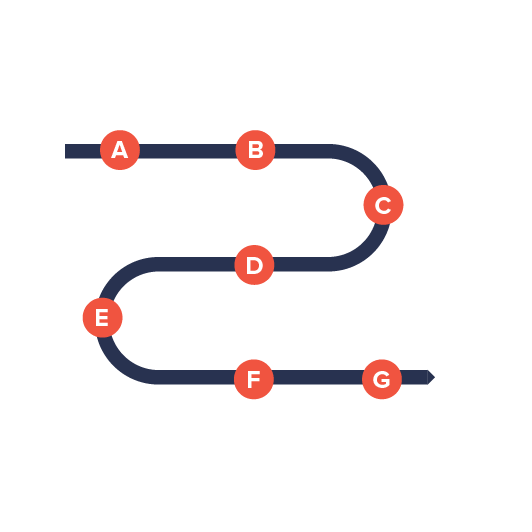
What are control points?
As we already mentioned, the shape of the chart is controlled via curvature of its X axis.
The curvature is set via array of control points, connected by straight lines.
Graphically it looks something like this:


Each shape, however we put it is controlled by a few control points, connected by a straight line.
How to set control points?
Each point is expressed by its X/Y coordinate in form of the object, e.g.:
{
  x: 100,
  y: 100
}
Each shape is expressed by an array of such objects, e.g.:
[
  { x: -400, y: 0 },
  { x: -250, y: 0 },
  { x: 0, y: 60 },
  { x: 250, y: 0 },
  { x: 400, y: 0 }
]
And this array is set to X axis renderer's points property:
let xRenderer = am5timeline.AxisRendererCurveX.new(root, {
  points: [
    { x: -400, y: 0 },
    { x: -250, y: 0 },
    { x: 0, y: 60 },
    { x: 250, y: 0 },
    { x: 400, y: 0 }
  ],
  yRenderer: yRenderer
});
var xRenderer = am5timeline.AxisRendererCurveX.new(root, {
  points: [
    { x: -400, y: 0 },
    { x: -250, y: 0 },
    { x: 0, y: 60 },
    { x: 250, y: 0 },
    { x: 400, y: 0 }
  ],
  yRenderer: yRenderer
});
Auto-scale
While the points technically represent X and Y pixel coordinates, the chart will try to adjust them to fit the size of the container better.
This means that if you have your shape control points from, say, -100 to 100, and a chart container that's 400 pixels wide, those coordinates will be adjusted accordingly.
NOTE When auto-scaling, the chart will take both height and with of the chart into account. This means that the shape will be auto-adjusted to always fit into container both vertically and horizontally, while maintaining original aspect ratio.
Auto-center
The chart will try to automatically center your custom-curve chart to the middle of the chart container.
Axis length
OK, now that we know about creating curves for the chart to follow, let's talk about other dimensions: chart's thickness.
So far we have been looking at the curve as a line. However, a chart is not a line, it has height/thickness.
The length of the Y axis ("vertical") is a way to controlling it.
For the shape we have been using our X axis.
To control chart height, we will be using its Y axis.
For that its renderer has two settings: axisLength and axisLocation.
| Setting | Default | Comment |
|---|---|---|
axisLength | 60 | Absolute axis length in pixels. |
axisLocation | 0.5 | Relative position of the horizontal axis in in relation to the vertical axis. From 0 to 1. |
let yAxis = chart.yAxes.push(
  am5xy.ValueAxis.new(root, {
    renderer: am5timeline.AxisRendererCurveY.new(root, {
      axisLength: 80
      axisLocation: 1
    })
  })
);

var yAxis = chart.yAxes.push(
  am5xy.ValueAxis.new(root, {
    renderer: am5timeline.AxisRendererCurveY.new(root, {
      axisLength: 80
      axisLocation: 1
    })
  })
);
Here's how radius axisLocation setting affect the real chart:

axisLocation: 0.5 (default)
axisLocation: 1
axisLocation: 0Using SVG paths
Creating custom SVG path in an editor
You can use any graphical editor, that is capable of saving vector-based information in an SVG format.
For the purpose of this tutorial, let's use Inkscape - an excellent open-source vector graphics editor.
To create a path, follow these three steps:
- Create a path in editor.
- Save as SVG, open it in any text editor, and look for the
<path>element. Then grab whatever in it'sdattribute - it's the SVG path.


Using existing SVG file
You can use existing SVG as well.
Like in previous step, open them in a text editor, and look for <path> elements.
Converting path to curve points
Finally, we need to convert an SVG path, into a curve points we've discussed earlier in this article.
For that, simply use this pre-made tool.
Paste your path data into the first text area. Click submit button. Grab converted point data from the second text area.
See the Pen amCharts 4: SVG path converter to points by amCharts team (@amcharts) on CodePen.
Why can't we use SVG path instead of points?
The tool above uses some methods that are not available in all browsers.
As a developer, you have a choice of using different browsers to create point data once.
But you don't want to enforce that on your users, hence converting it to point data, which will work in all browsers now, or in the future.
Complimentary chart types
Timeline comes with a couple complimentary chart types, that allows easy creation of the configurable Curve charts, without defining actual points.
Serpentine
Serpentine chart (SerpentineChart) is a wrapper for CurveChart which automatically generates horizontal or vertical waved curves, based on certain parameters. It sort of looks like a mountain road, hence the name.
It's configured exactly the same way as CurveChart we already learned, except we use SerpentineChart class which brings a few additional options to the table.
Serpentine chart options
Let's take a look at the few unique options available for SerpentineChart.
| Option | Default | Comment |
|---|---|---|
levelCount | 3 | Number of "levels" the chart will have. E.g. 3 (three) means there will be three straight lines of chart with two curved turns connecting them. |
orientation | "vertical" | Indicates the direction the "road" will weave in:"vertical" (default) will make the chart start at the top and go down."horizontal" will start at the left and got to right. |
startLocation | 0 | A relative location to start the "road" in relation to the width of the chart. E.g. 0 means the start, 0.5 - the middle, and 1 - the end. |
endLocation | 1 | A relative location to end the "road" in relation to the width of the chart. E.g. 0 means the start, 0.5 - the middle, and 1 - the end. |
yAxisRadius | 50% | This setting will be automatically applied to all Y axes' radius. |
Serpentine example
See the Pen Timeline chart: Serpentine by amCharts team (@amcharts) on CodePen.
Spiral
SpiralChart is another helpful wrapper for CurveChart. Based on parameters it automatically wraps the chart into a spiral, without the need to define control points for that shape.
Serpentine chart options
Let's see what options are available for the SpiralChart.
| Option | Default | Comment |
|---|---|---|
| 0 | An angle the spiral will end at. |
| 20% | Inner radius of the the spiral. |
levelCount | 3 | Number of rings the spiral will consist of. |
startAngle | -90 | An angle the spiral will start at. |
yAxisRadius | 60% | This setting will be automatically applied to all Y axes' radius. |
Spiral example
See the Pen Timeline chart: Spiral by amCharts team (@amcharts) on CodePen.
Complete example
import * as am5 from "@amcharts/amcharts5";
import * as am5xy from "@amcharts/amcharts5/xy";
import * as am5timeline from "@amcharts/amcharts5/timeline";

// Create root and chart
let root = am5.Root.new("chartdiv");
let chart = root.container.children.push(
  am5timeline.CurveChart.new(root, {})
);

// Define data
let data = [{
  date: new Date(2021, 0, 1).getTime(),
  value: 100
}, {
  date: new Date(2021, 0, 2).getTime(),
  value: 320
}, {
  date: new Date(2021, 0, 3).getTime(),
  value: 216
}, {
  date: new Date(2021, 0, 4).getTime(),
  value: 150
}, {
  date: new Date(2021, 0, 5).getTime(),
  value: 156
}, {
  date: new Date(2021, 0, 6).getTime(),
  value: 199
}, {
  date: new Date(2021, 0, 7).getTime(),
  value: 114
}, {
  date: new Date(2021, 0, 8).getTime(),
  value: 269
}, {
  date: new Date(2021, 0, 9).getTime(),
  value: 190
}, {
  date: new Date(2021, 0, 10).getTime(),
  value: 380
}, {
  date: new Date(2021, 0, 11).getTime(),
  value: 250
}, {
  date: new Date(2021, 0, 12).getTime(),
  value: 110
}, {
  date: new Date(2021, 0, 13).getTime(),
  value: 185
}, {
  date: new Date(2021, 0, 14).getTime(),
  value: 105
}];

// Create axes
let yRenderer = am5timeline.AxisRendererCurveY.new(root, {
  axisLocation: 0,
  axisLength: 150
});

let xRenderer = am5timeline.AxisRendererCurveX.new(root, {
  points: [
    { x: 0, y: -300 },
    { x: 300, y: -300 },
    { x: 346.9, y: -296.3 },
    { x: 392.7, y: -285.3 },
    { x: 436.2, y: -267.3 },
    { x: 476.3, y: -242.7 },
    { x: 512.1, y: -212.1 },
    { x: 542.7, y: -176.3 },
    { x: 567.3, y: -136.2 },
    { x: 585.3, y: -92.7 },
    { x: 596.3, y: -46.9 },
    { x: 600, y: 0 },
    { x: 596.3, y: 46.9 },
    { x: 585.3, y: 92.7 },
    { x: 567.3, y: 136.2 },
    { x: 542.7, y: 176.3 },
    { x: 512.1, y: 212.1 },
    { x: 476.3, y: 242.7 },
    { x: 436.2, y: 267.3 },
    { x: 392.7, y: 285.3 },
    { x: 346.9, y: 296.3 },
    { x: -300, y: 300 },
    { x: -346.9, y: 296.3 },
    { x: -392.7, y: 285.3 },
    { x: -436.2, y: 267.3 },
    { x: -476.3, y: 242.7 },
    { x: -512.1, y: 212.1 },
    { x: -542.7, y: 176.3 },
    { x: -567.3, y: 136.2 },
    { x: -585.3, y: 92.7 },
    { x: -596.3, y: 46.9 },
    { x: -600, y: 0 },
    { x: -596.3, y: -46.9 },
    { x: -585.3, y: -92.7 },
    { x: -567.3, y: -136.2 },
    { x: -542.7, y: -176.3 },
    { x: -512.1, y: -212.1 },
    { x: -476.3, y: -242.7 },
    { x: -436.2, y: -267.3 },
    { x: -392.7, y: -285.3 },
    { x: -346.9, y: -296.3 },
    { x: 0, y: -300 }
  ],
  yRenderer: yRenderer
});

let yAxis = chart.yAxes.push(
  am5xy.ValueAxis.new(root, {
    renderer: yRenderer
  })
);

let xAxis = chart.xAxes.push(
  am5xy.DateAxis.new(root, {
    baseInterval: { timeUnit: "day", count: 1 },
    renderer: xRenderer
  })
);

// Create series
let series = chart.series.push(
  am5timeline.CurveColumnSeries.new(root, {
    name: "Series",
    xAxis: xAxis,
    yAxis: yAxis,
    valueYField: "value",
    valueXField: "date"
  })
);

series.columns.template.setAll({
  width: am5.percent(30)
});

series.data.setAll(data);

// Add legend
let legend = chart.children.push(am5.Legend.new(root, {}));
legend.data.setAll(chart.series.values);

// Add cursor
let cursor = chart.set("cursor", am5timeline.CurveCursor.new(root, {
  behavior: "zoomX",
  xAxis: xAxis,
  yAxis
}));
<script src="https://cdn.amcharts.com/lib/5/index.js"></script>
<script src="https://cdn.amcharts.com/lib/5/xy.js"></script>
<script src="https://cdn.amcharts.com/lib/5/timeline.js"></script>

<div id="chartdiv"></div>

<script>
// Create root and chart
var root = am5.Root.new("chartdiv");
var chart = root.container.children.push(
  am5timeline.CurveChart.new(root, {})
);

// Define data
var data = [{
  date: new Date(2021, 0, 1).getTime(),
  value: 100
}, {
  date: new Date(2021, 0, 2).getTime(),
  value: 320
}, {
  date: new Date(2021, 0, 3).getTime(),
  value: 216
}, {
  date: new Date(2021, 0, 4).getTime(),
  value: 150
}, {
  date: new Date(2021, 0, 5).getTime(),
  value: 156
}, {
  date: new Date(2021, 0, 6).getTime(),
  value: 199
}, {
  date: new Date(2021, 0, 7).getTime(),
  value: 114
}, {
  date: new Date(2021, 0, 8).getTime(),
  value: 269
}, {
  date: new Date(2021, 0, 9).getTime(),
  value: 190
}, {
  date: new Date(2021, 0, 10).getTime(),
  value: 380
}, {
  date: new Date(2021, 0, 11).getTime(),
  value: 250
}, {
  date: new Date(2021, 0, 12).getTime(),
  value: 110
}, {
  date: new Date(2021, 0, 13).getTime(),
  value: 185
}, {
  date: new Date(2021, 0, 14).getTime(),
  value: 105
}];

// Create axes
var yRenderer = am5timeline.AxisRendererCurveY.new(root, {
  axisLocation: 0,
  axisLength: 150
});

var xRenderer = am5timeline.AxisRendererCurveX.new(root, {
  points: [
    { x: 0, y: -300 },
    { x: 300, y: -300 },
    { x: 346.9, y: -296.3 },
    { x: 392.7, y: -285.3 },
    { x: 436.2, y: -267.3 },
    { x: 476.3, y: -242.7 },
    { x: 512.1, y: -212.1 },
    { x: 542.7, y: -176.3 },
    { x: 567.3, y: -136.2 },
    { x: 585.3, y: -92.7 },
    { x: 596.3, y: -46.9 },
    { x: 600, y: 0 },
    { x: 596.3, y: 46.9 },
    { x: 585.3, y: 92.7 },
    { x: 567.3, y: 136.2 },
    { x: 542.7, y: 176.3 },
    { x: 512.1, y: 212.1 },
    { x: 476.3, y: 242.7 },
    { x: 436.2, y: 267.3 },
    { x: 392.7, y: 285.3 },
    { x: 346.9, y: 296.3 },
    { x: -300, y: 300 },
    { x: -346.9, y: 296.3 },
    { x: -392.7, y: 285.3 },
    { x: -436.2, y: 267.3 },
    { x: -476.3, y: 242.7 },
    { x: -512.1, y: 212.1 },
    { x: -542.7, y: 176.3 },
    { x: -567.3, y: 136.2 },
    { x: -585.3, y: 92.7 },
    { x: -596.3, y: 46.9 },
    { x: -600, y: 0 },
    { x: -596.3, y: -46.9 },
    { x: -585.3, y: -92.7 },
    { x: -567.3, y: -136.2 },
    { x: -542.7, y: -176.3 },
    { x: -512.1, y: -212.1 },
    { x: -476.3, y: -242.7 },
    { x: -436.2, y: -267.3 },
    { x: -392.7, y: -285.3 },
    { x: -346.9, y: -296.3 },
    { x: 0, y: -300 }
  ],
  yRenderer: yRenderer
});

var yAxis = chart.yAxes.push(
  am5xy.ValueAxis.new(root, {
    renderer: yRenderer
  })
);

var xAxis = chart.xAxes.push(
  am5xy.DateAxis.new(root, {
    baseInterval: { timeUnit: "day", count: 1 },
    renderer: xRenderer
  })
);

// Create series
var series = chart.series.push(
  am5timeline.CurveColumnSeries.new(root, {
    name: "Series",
    xAxis: xAxis,
    yAxis: yAxis,
    valueYField: "value",
    valueXField: "date"
  })
);

series.columns.template.setAll({
  width: am5.percent(30)
});

series.data.setAll(data);

// Add legend
var legend = chart.children.push(am5.Legend.new(root, {}));
legend.data.setAll(chart.series.values);

// Add cursor
var cursor = chart.set("cursor", am5timeline.CurveCursor.new(root, {
  behavior: "zoomX",
  xAxis: xAxis,
  yAxis
}));
</script>
See the Pen Timeline chart by amCharts team (@amcharts) on CodePen.