Flow chart
A chord diagram is a flow chart. For generic flow chart related information, please visit "Flow charts" tutorial.
Types of chord
There are three main types of chord series: regular, directed, and non-ribbon.
The type of the series not only affects how links look, but also how value of the node is calculated, which in turn affects its width.
| Regular series | Directed series | Non-ribbon series |
|---|---|---|
Chord | ChordDirected | ChordNonRibbon |
| Node size depends on a sum of all outgoing links. | Node size depends on a sum of all incoming and outgoing links. | Node size is fixed regardless of actual values. |
 |  |  |
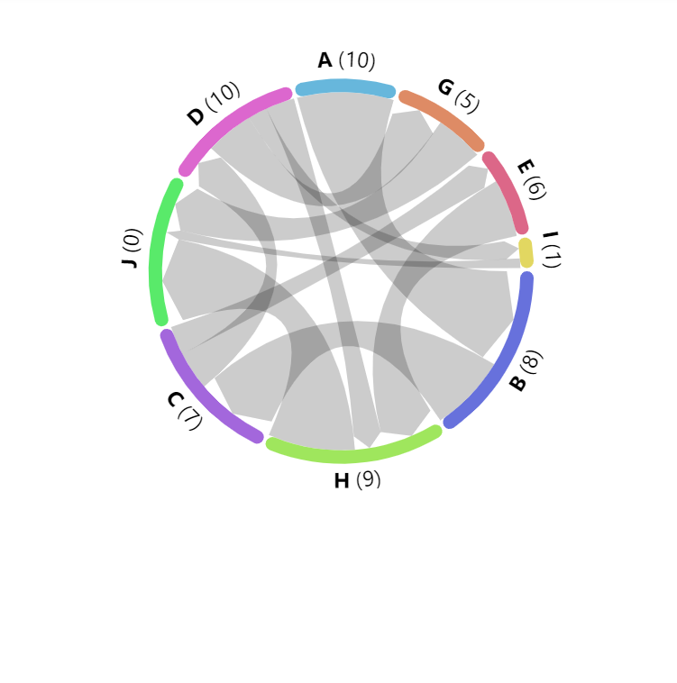
Regular series
Regular chord series is created using Chord class.
It sizes nodes based on a sum of values of all outgoing links.
let series = root.container.children.push(
  am5flow.Chord.new(root, {
    sourceIdField: "from",
    targetIdField: "to",
    valueField: "value"
  })
);
var series = root.container.children.push(
  am5flow.Chord.new(root, {
    sourceIdField: "from",
    targetIdField: "to",
    valueField: "value"
  })
);
See the Pen Sankey diagram by amCharts team (@amcharts) on CodePen.
There are no special regular-chord-only settings.
Directed series
Chord directed sizes its nodes base on sum of both the outgoing and incoming links.
It also indicates the direction of the link by adding an arrowhead at the target end.
The length of the arrowhead is 10 pixels by default. We can change it by setting series' linkHeadRadius setting.
We can also disable arrowhead altogether by setting linkHeadRadius to null:
let series = root.container.children.push(
  am5flow.ChordDirected.new(root, {
    sourceIdField: "from",
    targetIdField: "to",
    valueField: "value",
    linkHeadRadius: null
  })
);
var series = root.container.children.push(
  am5flow.ChordDirected.new(root, {
    sourceIdField: "from",
    targetIdField: "to",
    valueField: "value",
    linkHeadRadius: null
  })
);
linkHeadRadius: 10 (default)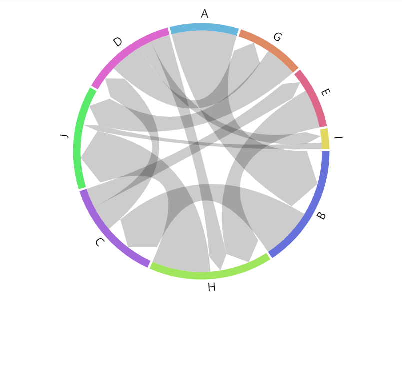
linkHeadRadius: 20
linkHeadRadius: nullSee the Pen Chord diagram by amCharts team (@amcharts) on CodePen.
Non-ribbon series
Non-ribbon chord series does not take any value into account when sizing its nodes.
It also displays links as thin lines, that are curved from source to target node.
We can make them display as straight lines by setting series linkType setting to "line":
let series = root.container.children.push(
  am5flow.ChordNonRibbon.new(root, {
    sourceIdField: "from",
    targetIdField: "to",
    valueField: "value",
    linkType: "line"
  })
);
var series = root.container.children.push(
  am5flow.ChordNonRibbon.new(root, {
    sourceIdField: "from",
    targetIdField: "to",
    valueField: "value",
    linkType: "line"
  })
);
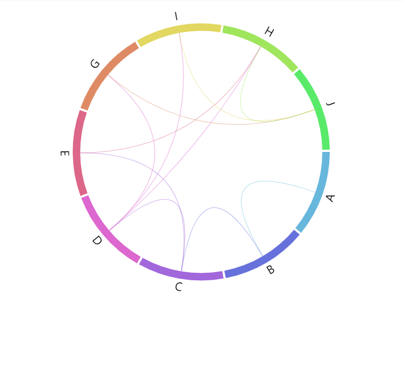
linkType: "curve" (default)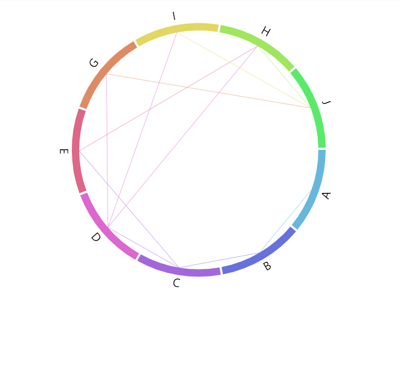
linkType: "line"See the Pen Chord directed diagram by amCharts team (@amcharts) on CodePen.
Nodes
Width
Nodes (colored bands) are 10 pixel wide by default.
We can use series setting nodeWidth to change that:
let series = root.container.children.push(
  am5flow.Chord.new(root, {
    sourceIdField: "from",
    targetIdField: "to",
    valueField: "value",
    nodeWidth: 5
  })
);
var series = root.container.children.push(
  am5flow.Chord.new(root, {
    sourceIdField: "from",
    targetIdField: "to",
    valueField: "value",
    nodeWidth: 5
  })
);
nodeWidth: 10 (default)
nodeWidth: 30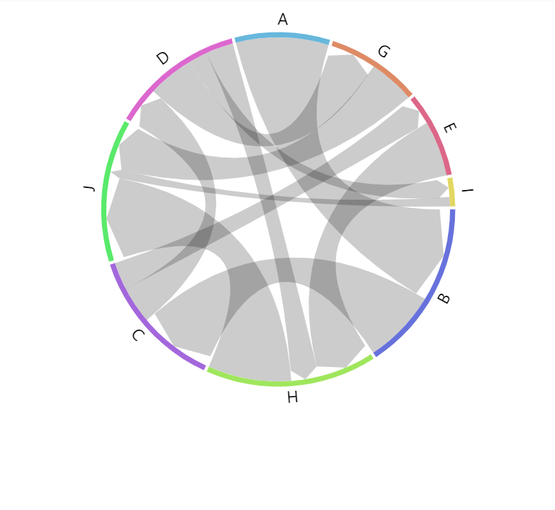
nodeWidth: 5Configuring nodes
Nodes in flow diagrams are represented by their own series, accessible via read-only property nodes which is an object of type ChordNodes.
It subsequently has a property rectangles which is a list of all nodes in series.
Since it's a "list template", we can use its template property to set any setting for the node, which is of type Slice:
series.nodes.rectangles.template.setAll({
  fillOpacity: 0.5,
  stroke: am5.color(0x000000),
  strokeWidth: 1
});
series.nodes.rectangles.template.setAll({
  fillOpacity: 0.5,
  stroke: am5.color(0x000000),
  strokeWidth: 1
});
See the Pen Chord diagram by amCharts team (@amcharts) on CodePen.
Node data
Setting node data
In chord diagrams, node ids (and names) are derived from link data (via sourceIdField and targetIdField).
In some cases, we might need more than just node id which comes from chord data.
For that we can set own data on series.nodes.data:
series.nodes.data.setAll([
  { id: "A", name: "Node A" },
  { id: "B", name: "Node B" },
  { id: "C", name: "Node C" }
]);
series.nodes.data.setAll([
  { id: "A", name: "Node A" },
  { id: "B", name: "Node B" },
  { id: "C", name: "Node C" }
]);
Modifying data fields
Node series (which is ChordNodes) is automatically set up for these data fields:
| Data field | Default value | Comment |
|---|---|---|
idField | "id" | ID of the node. |
nameField | "id" | Name of the node. |
fillField | "fill" | Fill color for the node. |
We can modify those to suit our data:
series.nodes.setAll({
  idField: "id",
  nameField: "name"
});

series.nodes.data.setAll([
  { id: "A", name: "Node A" },
  { id: "B", name: "Node B" },
  { id: "C", name: "Node C" }
]);
series.nodes.setAll({
  idField: "id",
  nameField: "name"
});

series.nodes.data.setAll([
  { id: "A", name: "Node A" },
  { id: "B", name: "Node B" },
  { id: "C", name: "Node C" }
]);
IMPORTANTData fields need to be set before data or they will not work as expected.
Node colors via data
We can also specify custom colors for nodes via node data:
series.nodes.data.setAll([
  { id: "A", name: "Node A", fill: am5.color(0xFF621F) },
  { id: "B", name: "Node B", fill: am5.color(0x297373) },
  { id: "C", name: "Node C", fill: am5.color(0x946B49) }
]);
series.nodes.data.setAll([
  { id: "A", name: "Node A", fill: am5.color(0xFF621F) },
  { id: "B", name: "Node B", fill: am5.color(0x297373) },
  { id: "C", name: "Node C", fill: am5.color(0x946B49) }
]);
The fill color will be lookup up in a "fill" field of the data. If we need to use something else, we will need to configure node series' fillField as well:
series.nodes.setAll({
  idField: "id",
  nameField: "name",
  fillField: "color"
});

series.nodes.data.setAll([
  { id: "A", name: "Node A", color: am5.color(0xFF621F) },
  { id: "B", name: "Node B", color: am5.color(0x297373) },
  { id: "C", name: "Node C", color: am5.color(0x946B49) }
]);
series.nodes.setAll({
  idField: "id",
  nameField: "name",
  fillField: "color"
});

series.nodes.data.setAll([
  { id: "A", name: "Node A", color: am5.color(0xFF621F) },
  { id: "B", name: "Node B", color: am5.color(0x297373) },
  { id: "C", name: "Node C", color: am5.color(0x946B49) }
]);
Gaps between nodes
Chord diagrams display a tiny gap between each node by default.
We can control the size of it using series' padAngle setting.
It accepts a numeric value in degrees.
let series = root.container.children.push(
  am5flow.Chord.new(root, {
    sourceIdField: "from",
    targetIdField: "to",
    valueField: "value",
    padAngle: 5
  })
);
var series = root.container.children.push(
  am5flow.Chord.new(root, {
    sourceIdField: "from",
    targetIdField: "to",
    valueField: "value",
    padAngle: 5
  })
);
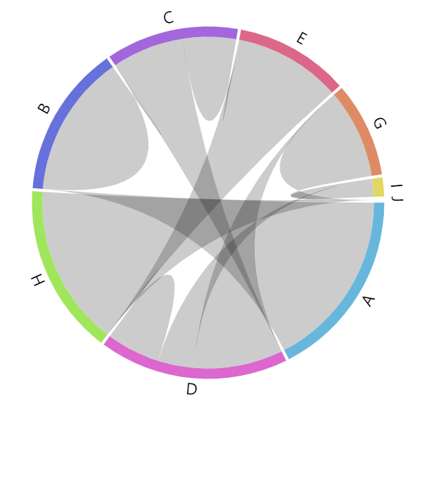
padAngle: 1 (default)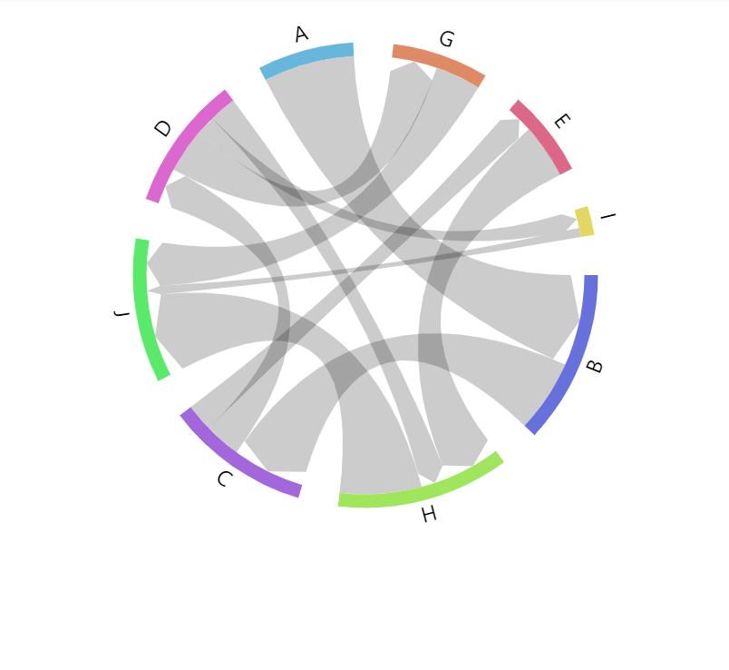
padAngle: 10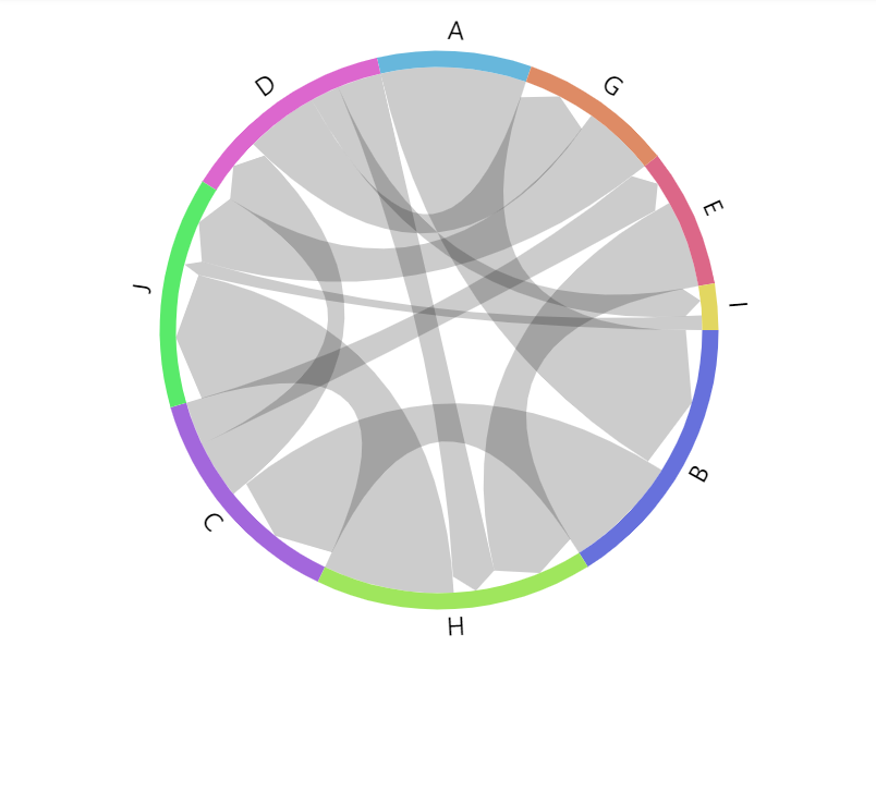
padAngle: 0Ordering nodes
Nodes in a chord diagram are ordered by their value: from biggest to smallest.
To change the order, there's a series setting sort with possible values: "descending" (default), "ascending", and "none".
If set to "none" the nodes will appear in the same order by their first appearance in data.
let series = root.container.children.push(
  am5flow.Chord.new(root, {
    sourceIdField: "from",
    targetIdField: "to",
    valueField: "value",
    order: "none"
  })
);
var series = root.container.children.push(
  am5flow.Chord.new(root, {
    sourceIdField: "from",
    targetIdField: "to",
    valueField: "value",
    order: "none"
  })
);
Radius
Chart's outer radius can be set using its radius setting.
It can be either percent value (relative to available space) or fixed pixel value.
Chord diagram's radius is set to 90% by default to leave some space for possible labels.
let series = root.container.children.push(
  am5flow.Chord.new(root, {
    sourceIdField: "from",
    targetIdField: "to",
    valueField: "value",
    radius: am5.percent(90)
  })
);
var series = root.container.children.push(
  am5flow.Chord.new(root, {
    sourceIdField: "from",
    targetIdField: "to",
    valueField: "value",
    radius: am5.percent(90)
  })
);
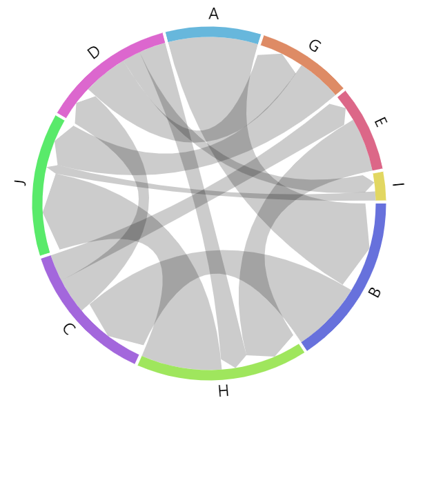
radius: am5.percent(90) (default)
radius: am5.percent(95)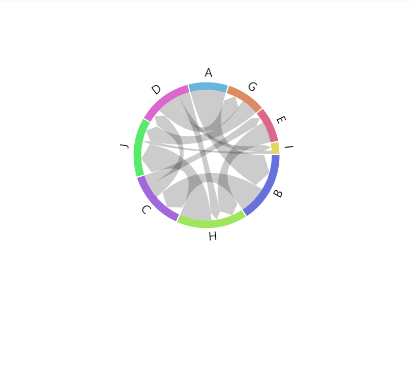
radius: 100Start angle
Chord diagram usually starts at zero angle (or the "right" edge of the circle). That's where first node is drawn.
We can change that using series' setting startAngle, which is a numeric value in degrees.
The angle can also be negative number:
let series = root.container.children.push(
  am5flow.Chord.new(root, {
    sourceIdField: "from",
    targetIdField: "to",
    valueField: "value",
    startAngle: -90
  })
);
var series = root.container.children.push(
  am5flow.Chord.new(root, {
    sourceIdField: "from",
    targetIdField: "to",
    valueField: "value",
    startAngle: -90
  })
);
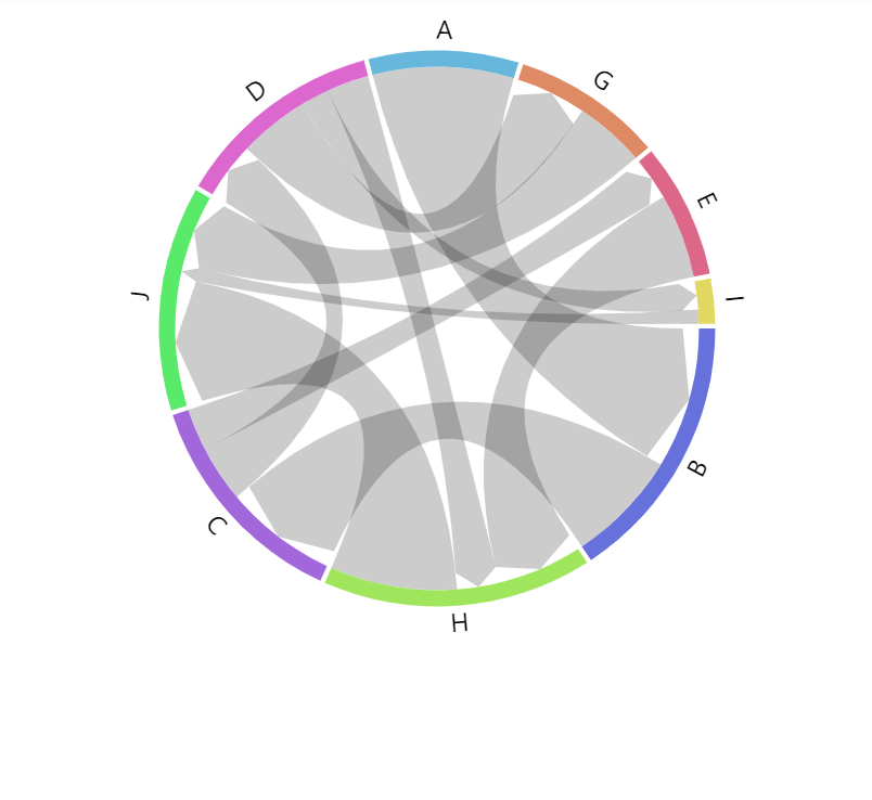
startAngle: 0 (default)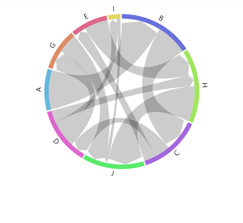
startAngle: -90Links
Configuring links
We can configure links using series property links.template. Via template, we can set any ChordLink setting.
series.links.template.setAll({
  fillOpacity: 0.5
});
series.links.template.setAll({
  fillOpacity: 0.5
});
Color mode
Chord links can be colored in a number of ways via link template's fillStyle setting:
series.links.template.setAll({
  fillStyle: "solid"
});
series.links.template.setAll({
  fillStyle: "solid"
});
These values are available for fillStyle:
fillStyle | Comment | Example |
|---|---|---|
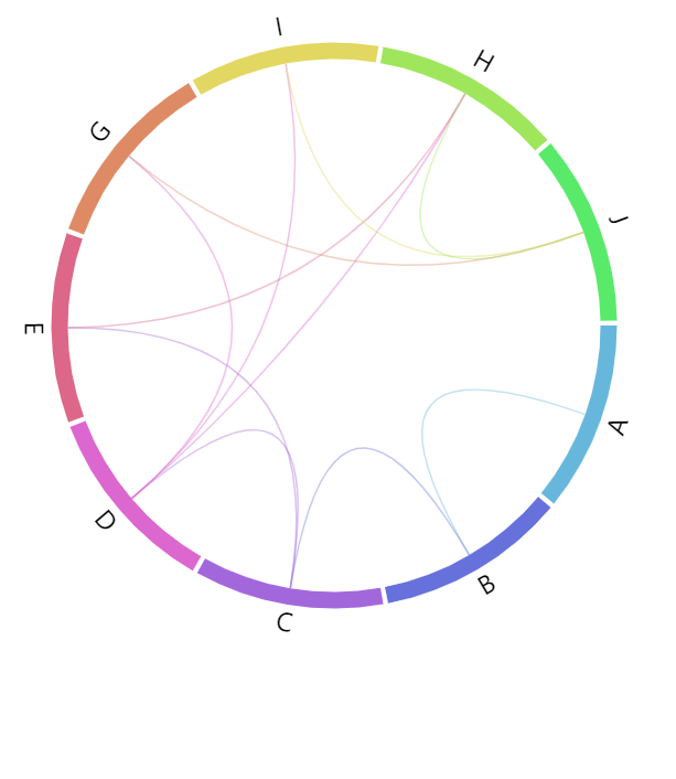
"solid" (default) | Solid color. | 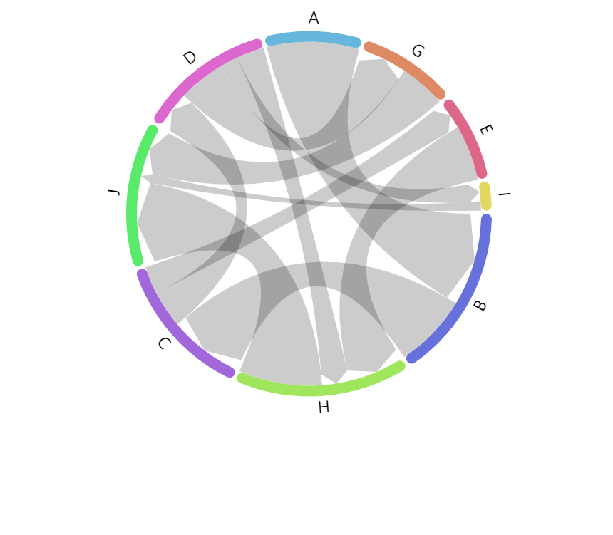 |
"gradient" | Gradient from source node color to target node color. | 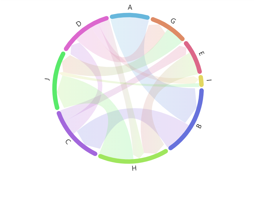 |
"source" | Source node color. | 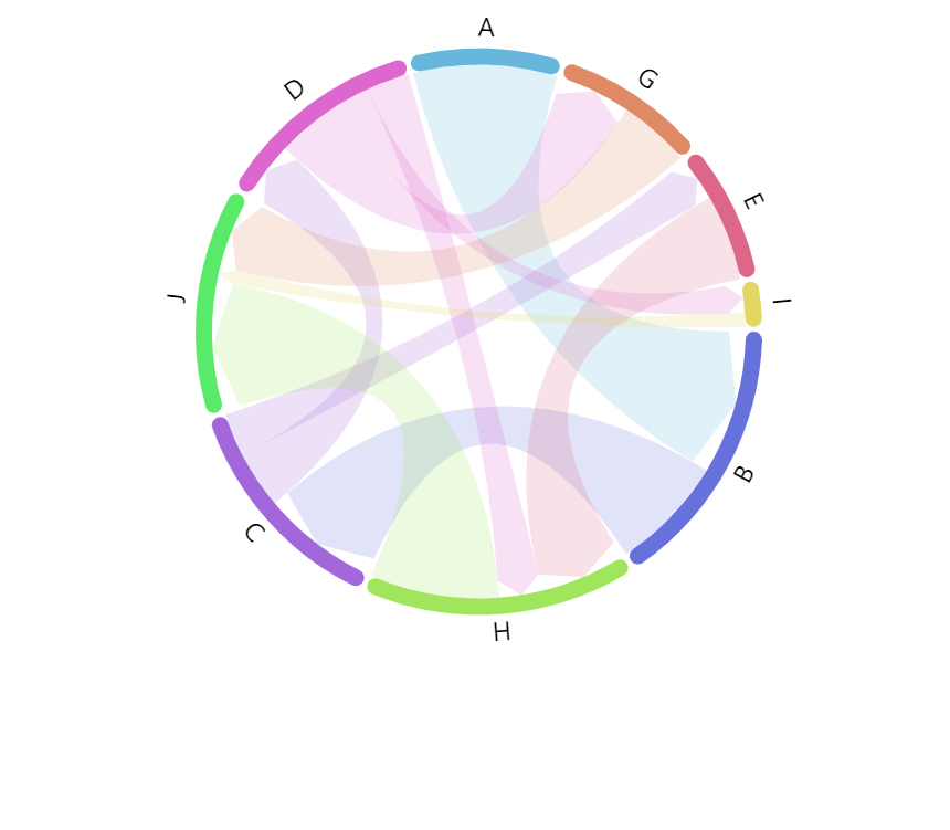 |
"target" | Target node color. | 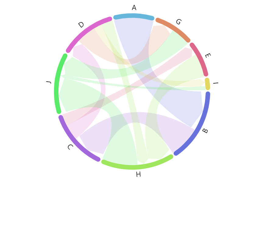 |
Labels
Chord diagram will display a label next to its nodes by default.
Configuring labels
Labels in chord diagram are attached to nodes, so they can be configured via nodes sub-series, specifically nodes.labels.template:
series.nodes.labels.template.setAll({
  fontSize: 20,
  maxWidth: 150,
  wrap: true
});
series.nodes.labels.template.setAll({
  fontSize: 20,
  maxWidth: 150,
  wrap: true
});
Refer to RadialLabel class reference for a full list of available settings.
Label content
To change label content, we only need to set text property of the label template:
series.nodes.labels.template.setAll({
  text: "[bold]{name}[/] ({sumOutgoing})"
});
series.nodes.labels.template.setAll({
  text: "[bold]{name}[/] ({sumOutgoing})"
});
Contents of the label can include data placeholders (codes in curly brackets that will be replaced by actual data) and in-line formatting blocks (formatting instructions enclosed in square brackets).
For available data placeholder fields refer to IChordNodesDataItem.
Label type
Normally, chord series will use circular labels: ones that follow the curve of the node itself.
This can be changed using label setting: textType.
Available values are: "circular" (default), "radial", and "adjusted".
series.nodes.labels.template.setAll({
  text: "[bold]{name}[/] ({sumOutgoing})",
  textType: "radial"
});
series.nodes.labels.template.setAll({
  text: "[bold]{name}[/] ({sumOutgoing})",
  textType: "radial"
});
textType: "circular" (default)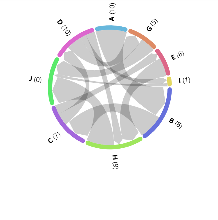
textType: "radial"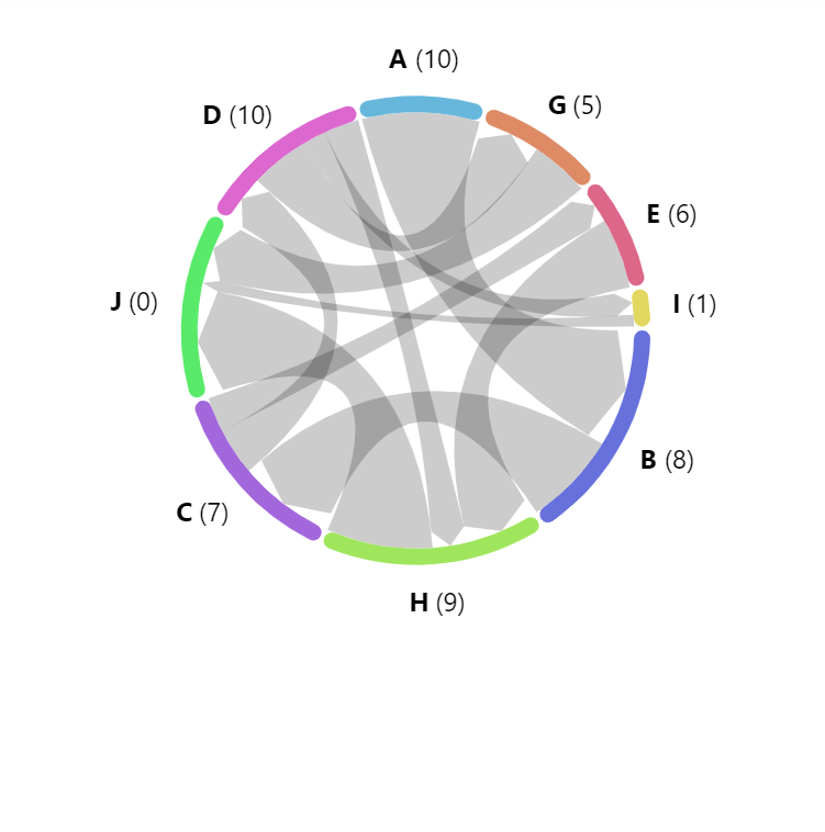
textType: "adjusted"See the Pen Chord directed diagram by amCharts team (@amcharts) on CodePen.
Label radius
The distance between label and outer edge of the node is controlled by label's radius setting.
It accepts numeric values in pixels, including negative values. The latter would put label inside the node.
series.nodes.labels.template.setAll({
  text: "[bold]{name}[/] ({sumOutgoing})",
  textType: "radial",
  radius: 20
});
series.nodes.labels.template.setAll({
  text: "[bold]{name}[/] ({sumOutgoing})",
  textType: "radial",
  radius: 20
});
Disabling labels
To disable labels, we can simply set their forceHidden to true:
series.nodes.labels.template.set("forceHidden", true);
series.nodes.labels.template.set("forceHidden", true);
Tooltips
On links
Links will display a tooltip when hovered/touched. The default content is "{sourceId} - {targetId}: {value}" which will show source node ID, followed by target node ID, and link value.
To change it, we can use link's tooltipText setting:
series.links.template.setAll({
  tooltipText: "From: [bold]{sourceId}[/]\nTo: [bold]{targetId}\nValue: [bold]{value}[/]"
});
series.links.template.setAll({
  tooltipText: "From: [bold]{sourceId}[/]\nTo: [bold]{targetId}\nValue: [bold]{value}[/]"
});
Contents of the tooltip can include data placeholders (codes in curly brackets that will be replaced by actual data) and in-line formatting blocks (formatting instructions enclosed in square brackets).
For available data placeholder fields refer to IChordDataItem.
On nodes
To add tooltips to nodes, simple set tooltipText on node template:
series.nodes.rectangles.template.setAll({
  tooltipText: "[bold]{name}[/]\nOutgoing: {sumOutgoing}\nIncoming: {sumIncoming}"
});
series.nodes.rectangles.template.setAll({
  tooltipText: "[bold]{name}[/]\nOutgoing: {sumOutgoing}\nIncoming: {sumIncoming}"
});
For available data placeholder fields refer to IChordNodesDataItem.