This tutorial will explain how individual column labels (bullets) can be used as Category axis labels.
The task
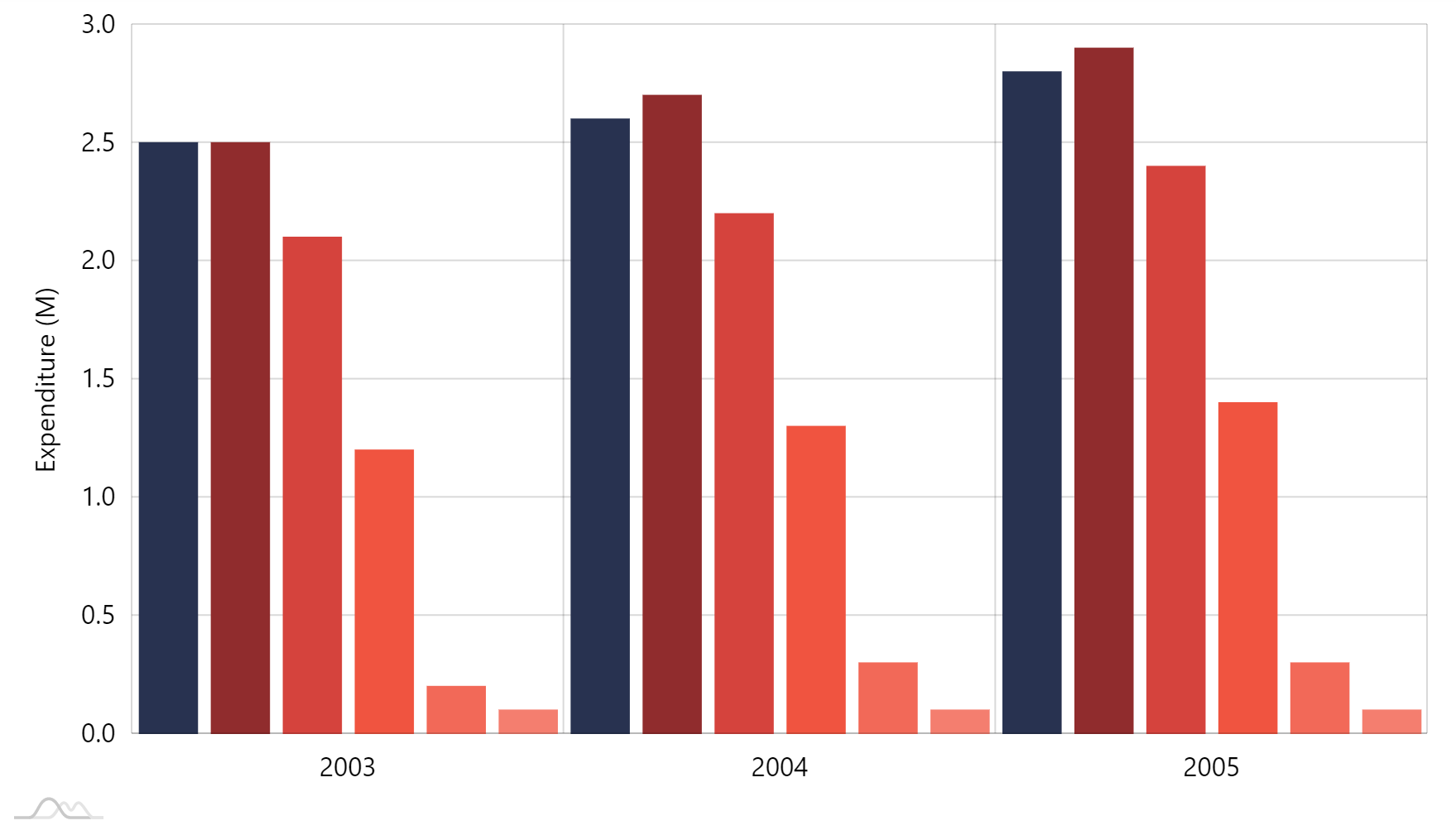
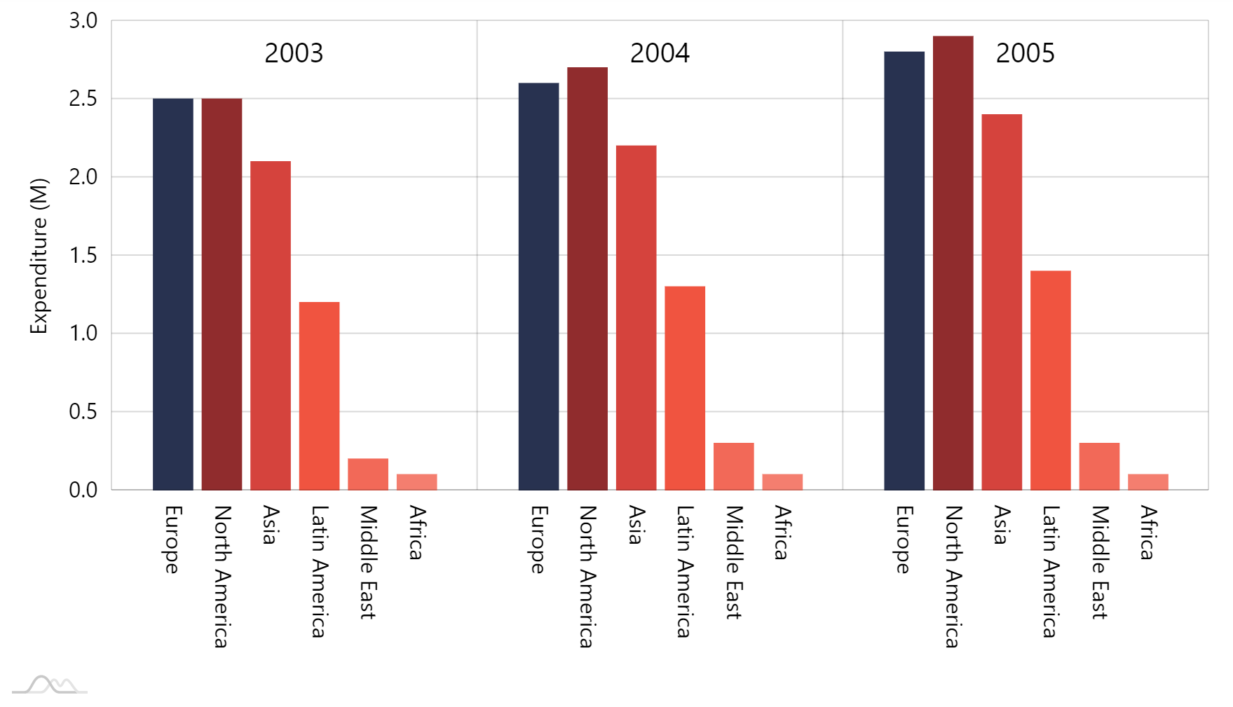
During the course of this tutorial, we are going to give a fairly basic clustered column chart a makeup.

Let's do this step by step.
Moving categories up
First task is to move those year categories up top.
To do so, we need to first put category labels inside the plot area as well as align them to top. While we're at it, let's also make them larger.
We're going to use an adapter for labels' dy setting (vertical shift), to move it upwards by the height of the chart's plot container.
xAxis.get("renderer").labels.template.setAll({
  inside: true,
  fontSize: 22
});

xAxis.get("renderer").labels.template.adapters.add("dy", function(y) {
  return -chart.plotContainer.height();
});
xAxis.get("renderer").labels.template.setAll({
  inside: true,
  fontSize: 22
});

xAxis.get("renderer").labels.template.adapters.add("dy", function(y) {
  return -chart.plotContainer.height();
});
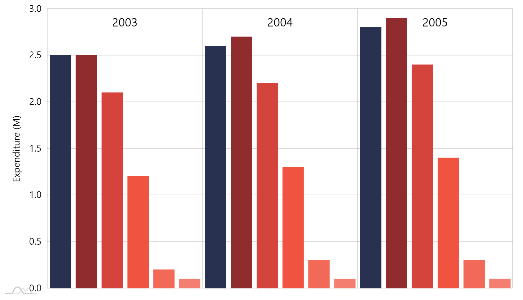
Notice how putting labels inside plot area frees up the space they previously occupied.
Label bullets
To add labels to columns we use bullets.
We're going to add those to our Column series, have them rotated and displaying series name.
To move the bullet to the bottom of the column, we're going to set bullet's locationY: 0.
We'll also rotate the label, so it's vertical. How settings rotation, centerX, and centerY work together is explained here.
series.bullets.push(function () {
  return am5.Bullet.new(root, {
    locationY: 0,
    sprite: am5.Label.new(root, {
      text: "{name}",
      fill: am5.color(0x000000),
      centerY: am5.p50,
      centerX: am5.p0,
      populateText: true,
      rotation: 90
    })
  });
});
series.bullets.push(function () {
  return am5.Bullet.new(root, {
    locationY: 0,
    sprite: am5.Label.new(root, {
      text: "{name}",
      fill: am5.color(0x000000),
      centerY: am5.p50,
      centerX: am5.p0,
      populateText: true,
      rotation: 90
    })
  });
});

OK, now were did the labels go?
There are two things: now that they are outside and there is no space at the bottom of the chart, they do not fit.
Another thing is that whole plot area is masked, so any bullet "protruding" from it is effectively immediately.
We'll need to fix that by setting fixed height for our X-axis, as well as unmasking bullets.
let xAxis = chart.xAxes.push(am5xy.CategoryAxis.new(root, {
  categoryField: "year",
  height: 100, // <-- set fixed height of the axis
  renderer: am5xy.AxisRendererX.new(root, {
    cellStartLocation: 0.1,
    cellEndLocation: 0.9
  }),
  tooltip: am5.Tooltip.new(root, {})
}));

// ...

let series = chart.series.push(am5xy.ColumnSeries.new(root, {
  name: name,
  xAxis: xAxis,
  yAxis: yAxis,
  valueYField: fieldName,
  categoryXField: "year",
  maskBullets: false // <-- unmask bullets
}));
var xAxis = chart.xAxes.push(am5xy.CategoryAxis.new(root, {
  categoryField: "year",
  height: 100, // <-- set fixed height of the axis
  renderer: am5xy.AxisRendererX.new(root, {
    cellStartLocation: 0.1,
    cellEndLocation: 0.9
  }),
  tooltip: am5.Tooltip.new(root, {})
}));

// ...

var series = chart.series.push(am5xy.ColumnSeries.new(root, {
  name: name,
  xAxis: xAxis,
  yAxis: yAxis,
  valueYField: fieldName,
  categoryXField: "year",
  maskBullets: false // <-- unmask bullets
}));
All done.
Working example
See the Pen Moving category labels to the top of the chart by amCharts team (@amcharts) on CodePen.